
Key takeaways
- Visitors ask three questions in order: am I in the right place, can I trust them, and how do I start.
- Five pages do most of the work: homepage, service pages, bios, fees and first visit, and contact.
- The first screen should say who you help and where, with one clear button.
- Smart Psych Websites launches a mental health site like this in 5 days, from $99 a month. Get a free preview of what your practice website could look like, built with your details, free and with no call needed.
A person finds your practice at 9pm on their phone. They are tired, a little anxious, and comparing you with two other tabs. They will decide in a few scrolls whether to call you, keep looking, or close everything and try again next week.
Healthcare website design is the work of making that decision easy. This guide walks through the pages that do the most work, the details that make calling simple, and the accessibility and privacy basics every healthcare site needs. It is written for mental health practices of every shape: solo therapists, psychiatry and PMHNP practices, interventional clinics and group practices.
What a patient is trying to learn on your site
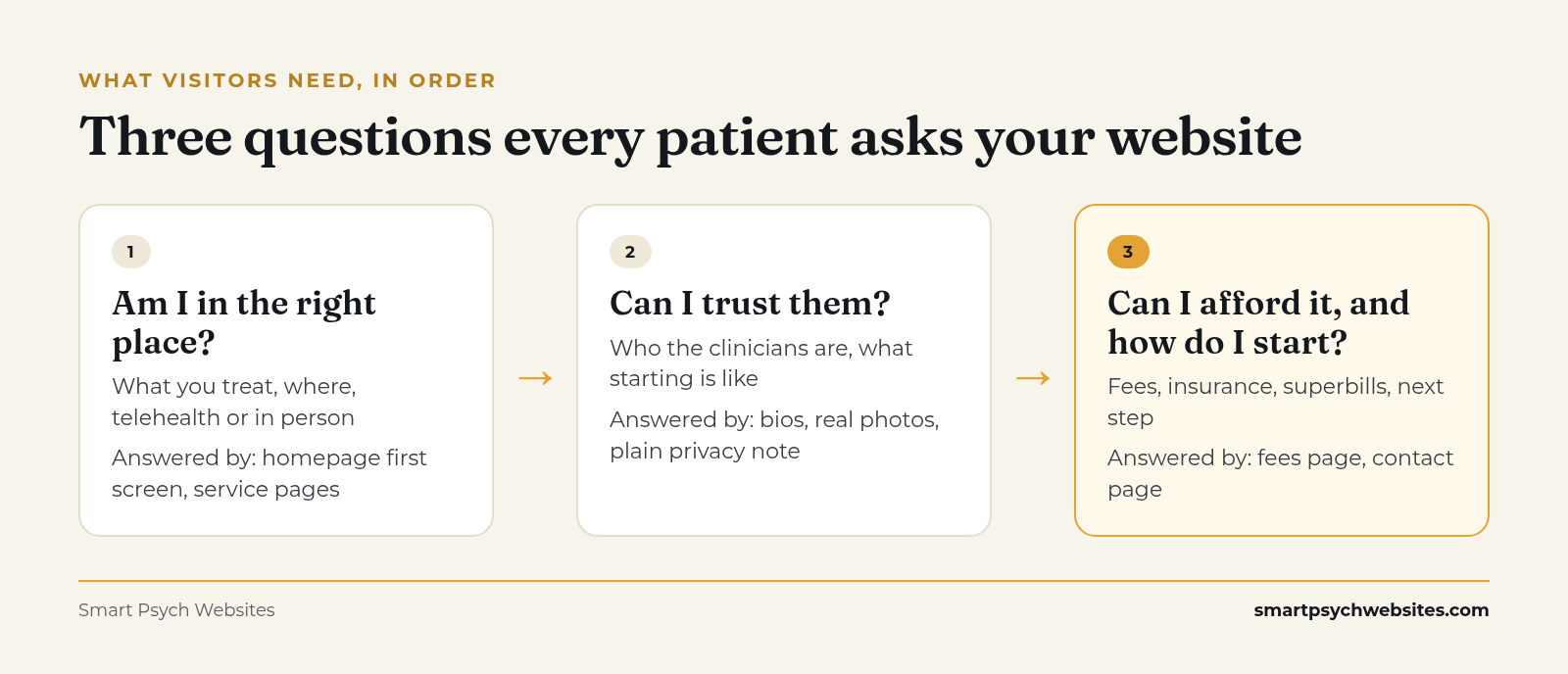 The three questions, and the pages that answer them. Source: Smart Psych Websites.
Almost every new visitor arrives with the same questions, in roughly this order:
- Am I in the right place? Do they treat what I am dealing with, in my area or online?
- Can I trust them? Who are the clinicians, and what is it like to start?
- Can I afford it, and how do I begin?
A healthcare website that answers those questions quickly, in plain words, gets calls. One that makes people dig for them loses visitors to the practice that answers first. Design decisions should follow that order.
The pages that do most of the work
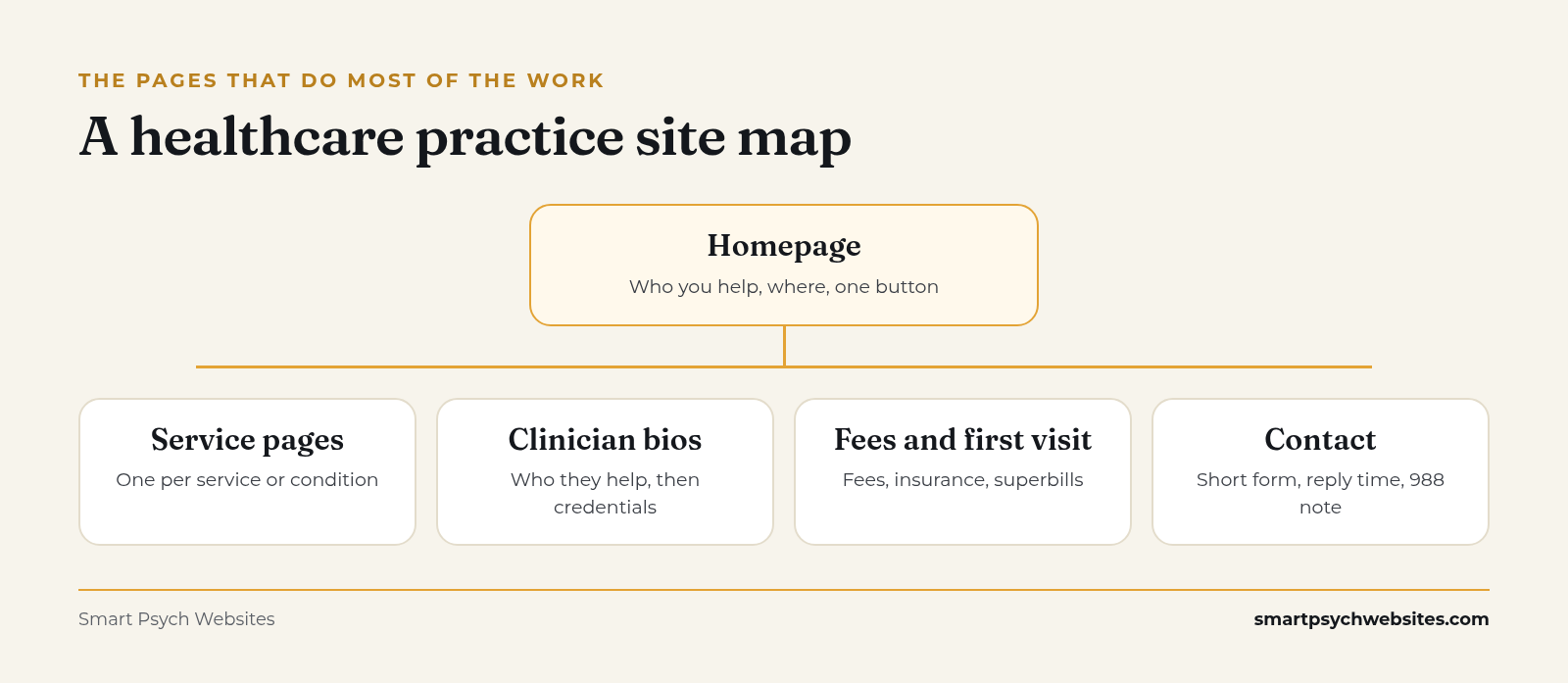 An annotated page map. Source: Smart Psych Websites.
Homepage: the first screen
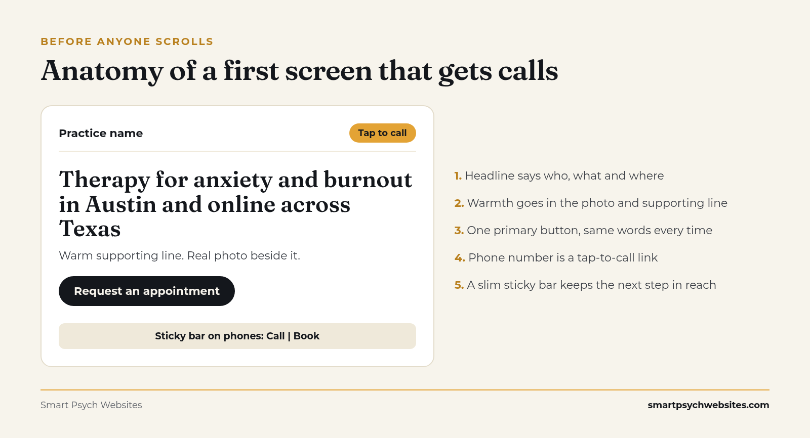 Trust elements above the fold. Source: Smart Psych Websites.
The top of your homepage, before anyone scrolls, needs to say who you help, what you help with, where you are (or that you offer telehealth in your state), and how to start. That fits in one headline, one supporting line and one button.
Compare two headlines:
- "Compassionate, holistic care for the whole person"
- "Therapy for anxiety and burnout in Austin and online across Texas"
The second one tells a visitor at a glance whether to keep reading. Put the warmth in the photo and the supporting line, and put the facts in the headline.
Service and condition pages
Each core service deserves its own page: anxiety therapy, couples counseling, medication management, TMS, ketamine-assisted therapy, ADHD evaluations. These pages rank in search, and they reassure the person who already knows what they need.
A strong service page covers who it is for, what a typical course of care looks like in your practice, telehealth or in person, fees or insurance, and one clear next step. Write it in the words patients use, then add clinical terms once, lower down, for searchers who use them.
Clinician bios
For mental health care especially, people choose a person. A useful bio leads with who the clinician works with and how sessions feel, then lists credentials and licenses. A real photo with good light beats a stock image every time. For group practices, add a simple "find your fit" page that sorts clinicians by specialty, age group, availability and location. Our group practice marketing guide covers how that page helps keep every schedule full.
Fees, insurance and first visit page
This is the page practices most often leave out, and it is one of the first things visitors look for. State your fees or fee range, which insurance plans you take or whether you are out of network, whether you provide superbills, and what the first appointment involves. Private-pay practices in particular depend on this page; see 4 Ways to Attract Private Pay Therapy Clients.
Contact page
Keep the form short: name, preferred contact method, phone or email, and an optional "anything you want us to know before we reach out" field with a note asking people not to share medical details. Say how quickly you usually reply and what happens next.
Design details that make calling easy
Small choices decide whether a motivated visitor reaches you.
- Tap to call on mobile. Your phone number should be a link on phones, in the header and the footer.
- One primary button, repeated. "Request an appointment" or "Book a consult" in the header, after the first section, and at the end of every service page. Use the same words each time.
- A sticky contact bar on phones. A slim bar at the bottom of the screen keeps the next step in reach while someone reads.
- A clear after-hours line. For mental health practices, the contact page and footer should say you are not an emergency service and point to 988 (call or text) or 911 (988 Lifeline).
- Visible response time. "We reply within one business day" lowers the worry of reaching out to a stranger.
- Booking links that work. If you use an online scheduler or intake portal, test it on a phone every month.
Healthcare-specific trust signals
Patients judge a healthcare site on whether it looks careful. Signals that help:
- Names, credentials and licensed states for every clinician
- A real office photo, entrance and parking notes for in-person care
- A privacy statement written in plain language
- Clear information on who is a good fit and who would be better served elsewhere
- A recent update date on articles, and a named clinician as author or reviewer
What hurts trust: stock photos of people laughing at salads, broken links, a footer that still says 2019, and vague promises.
Accessibility belongs in the design
Many visitors to a healthcare site have low vision, use a screen reader, or are reading through stress. The Web Content Accessibility Guidelines (WCAG) are the standard most teams build to (W3C WCAG overview), and the Department of Justice has published guidance on web accessibility under the ADA (ADA.gov).
Practical basics: text with strong contrast, readable font sizes, descriptive link text, alt text on images, forms with real labels, and a site you can move through with a keyboard alone. Build these in from the start. Fixing them later costs more.
Privacy: what belongs on your website and what does not
A practice website is a front door, and clinical information belongs inside the building. Keep it simple:
- Website forms collect only what is needed to reach someone
- Anything clinical goes through your HIPAA-compliant intake tool or EHR
- Be careful with tracking pixels and analytics on appointment and contact pages. HHS has issued guidance on online tracking technologies for HIPAA-covered entities; parts of it were challenged in court, so talk with your compliance advisor about your setup
Smart Psych Websites sites are built this way: no patient data touches our systems, and the site hands off to the HIPAA-compliant intake tool you already use.
Speed and mobile performance
Google mainly uses the mobile version of a site for indexing and ranking (Google Search Central) and describes Core Web Vitals as measures of loading, responsiveness and visual stability (Core Web Vitals). For patients, a slow page on a weak signal feels like a closed door.
Compress images, avoid autoplay video on the homepage, limit heavy plugins, and test your key pages on a phone over cellular data, away from office Wi-Fi.
Different practices need different first screens
The first screen should speak to the person most likely to arrive.
Therapy practices
Lead with who you help and how sessions feel. Visitors are often choosing between several similar profiles, so specificity wins. Our therapist website design guide goes deeper on this.
Psychiatry and PMHNP practices
Visitors want to know if you are taking new patients, whether you take their insurance, wait times, and whether you offer medication management by telehealth. See Psychiatry Website Design: What Actually Books Patients.
Interventional clinics (ketamine, Spravato, TMS)
These visitors are often referred, have tried other treatments, and need to know about candidacy, the screening process, insurance coverage and the time commitment. A calm, premium, clinical feel works well here. Referral information for physicians deserves its own page.
Group practices
The main job is matching. A strong "find your clinician" page and consistent bios matter more than any homepage animation.
| Practice type | What the first screen should answer |
|---|---|
| Therapy practice | Who you help, where, and telehealth or in person |
| Psychiatry or PMHNP | Evaluations, medication management, insurance |
| Interventional clinic | Which treatments, who qualifies, how to get a referral |
| Group practice | Specialties across the team and how matching works |
Words do half the design work
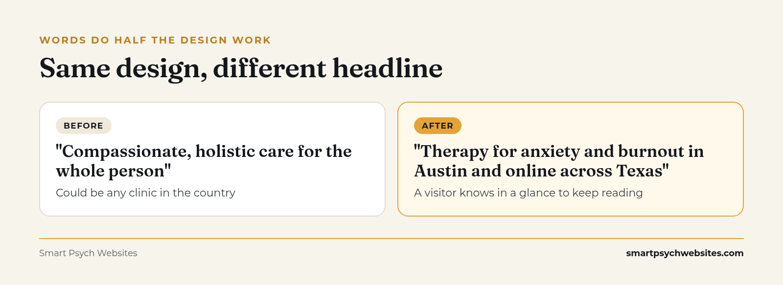 Same design, different headline. Source: Smart Psych Websites.
Most practice websites look fine and say too little. A headline like "Healing starts here" could belong to any clinic in the country. Specific copy tells the right person they found the right place, and tells the wrong-fit person to keep looking, which saves your consult calls.
If you want help with the words, the Therapist Homepage Copy Swipe File gives you fill-in-the-blank homepage, about and specialty page copy, with filled examples for a solo therapist, a psychiatric or PMHNP practice and a group practice. Comment COPY on our latest post on Instagram and we will send it to you, or get the free swipe file here.
A 10-minute check you can run tonight
Open your site on your phone and answer honestly:
- Can a stranger tell who you help and where within the first screen?
- Is there a button to start, visible without scrolling?
- Does tapping your phone number start a call?
- Can someone find your fees or insurance in two taps?
- Does every clinician have a real photo and a bio that starts with who they help?
- Does the contact page say how fast you reply and what happens next?
- Does the footer point to 988 or 911 for emergencies?
Every "no" is a place visitors are leaving.
How Smart Psych Websites handles this for you
Every one of our templates already has this structure built in, so you start with the pages and first screen above instead of a blank page.
- Starts at $99 a month. See every plan on our pricing page.
- $0 setup fee when you claim your free website within 72 hours of completing onboarding.
- You own your site from day one, and we can launch it in 5 days.
- Built for SEO from day one, structured to show up in Google and in answer engines.
- Made only for mental health practices. Browse our templates.
Our Organic Growth and Local Domination plans come with a 90-day growth guarantee for eligible practices. If we miss the target, your next month is free.*
*Eligibility is confirmed on a quick call. The target is at least 5 organic website inquiries or 500 visitors a month, measured over your first 90 days on the plan.
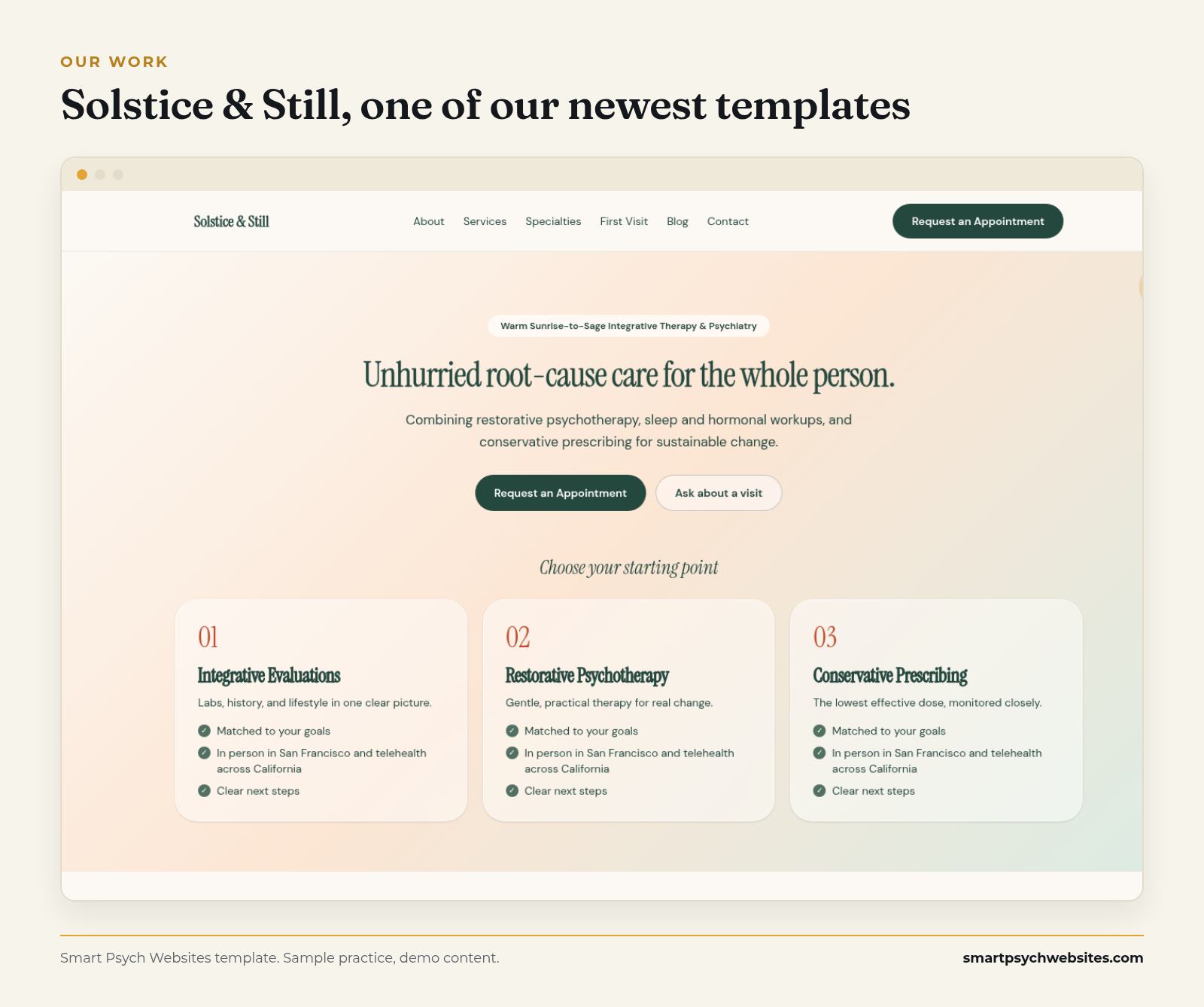 Solstice & Still, one of our newest templates. Demo content.
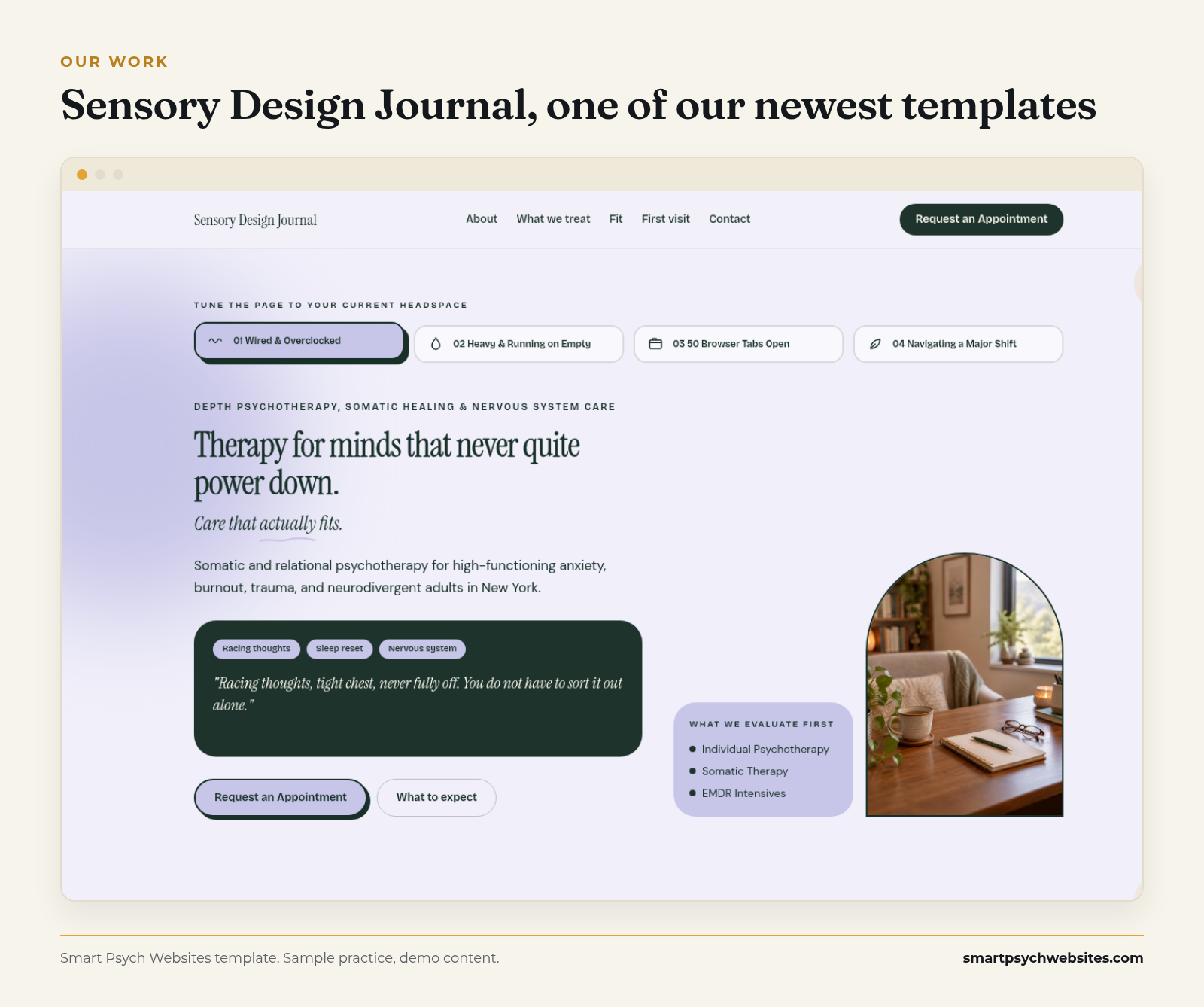 Sensory Design Journal, another of our newest templates. Demo content.
Get your free website preview
Reading about design only goes so far. Get a free preview of what your practice website could look like. We build it with your details, free and with no call needed.
No website yet? We will show you your practice on one of our mental health templates, with your details, before you pay anything: see your free website preview.
Smart Psych Websites builds monthly websites made only for mental health practices. The Smart Website plan starts at $99 a month with hosting, security and mobile-first design included, and Organic Growth adds four SEO articles a month. Compare them on our pricing page. More on getting those visitors to book is in How to Get More Therapy Clients.